PROJECT
Serenity ‒ Brangind & Logo Design
MY RESPONSIBILITY
Graphic Design
Logo Design
Branding
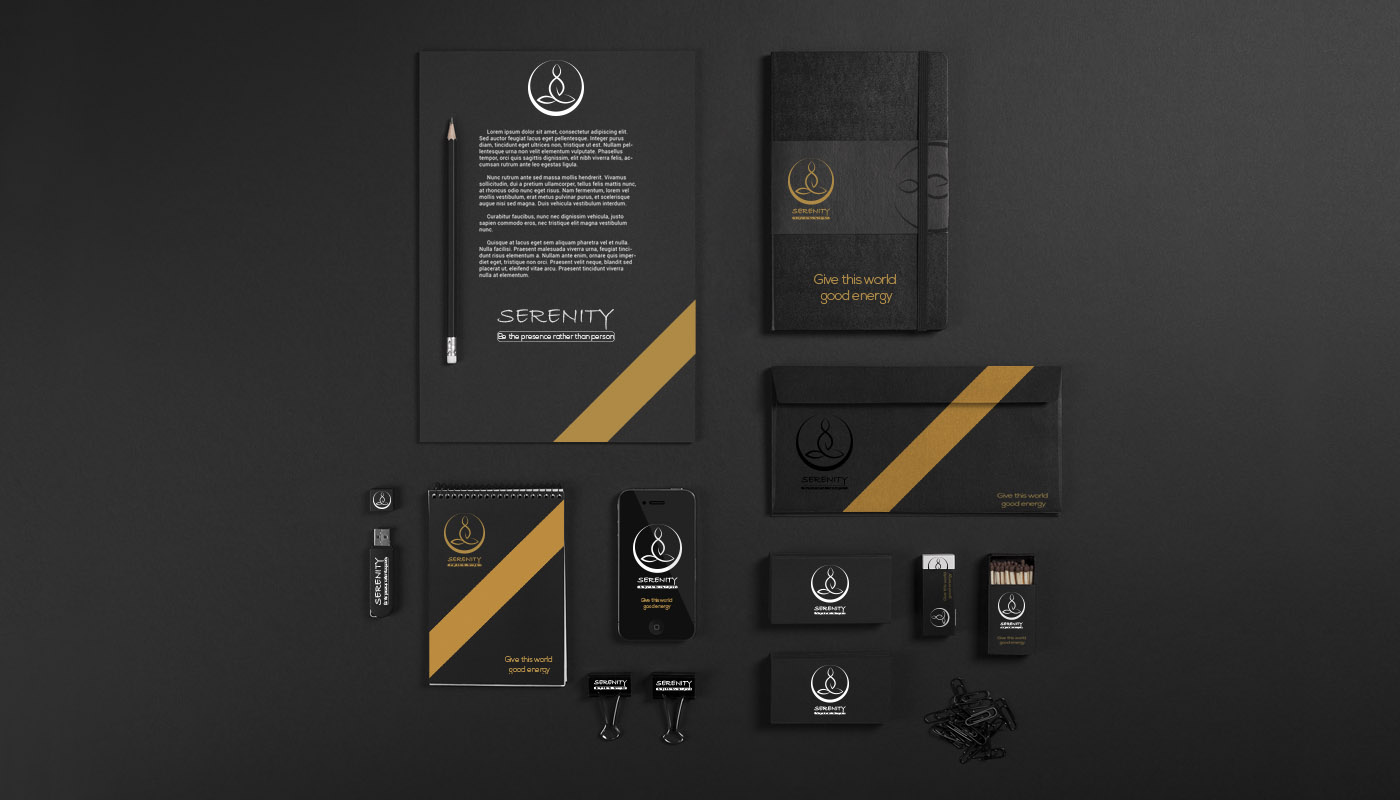
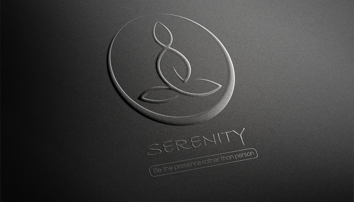
"Serenity" embodies the essence of tranquility, envisioned as the logo for a yoga studio.
With simplicity at the core of yoga philosophy, our aim was to create a design that resonated deeply with the practice while capturing its essence.
The concept behind the logo is to portray a figure in deep meditation, with the body formed by delicate lotus leaves—a nod to the profound connection between yoga and the symbolic lotus flower.
In yogic tradition, the lotus symbolizes spiritual growth and the unfolding of the soul, making it a fitting choice for our design.
By incorporating lotus elements, we sought to convey the serene state of meditation.
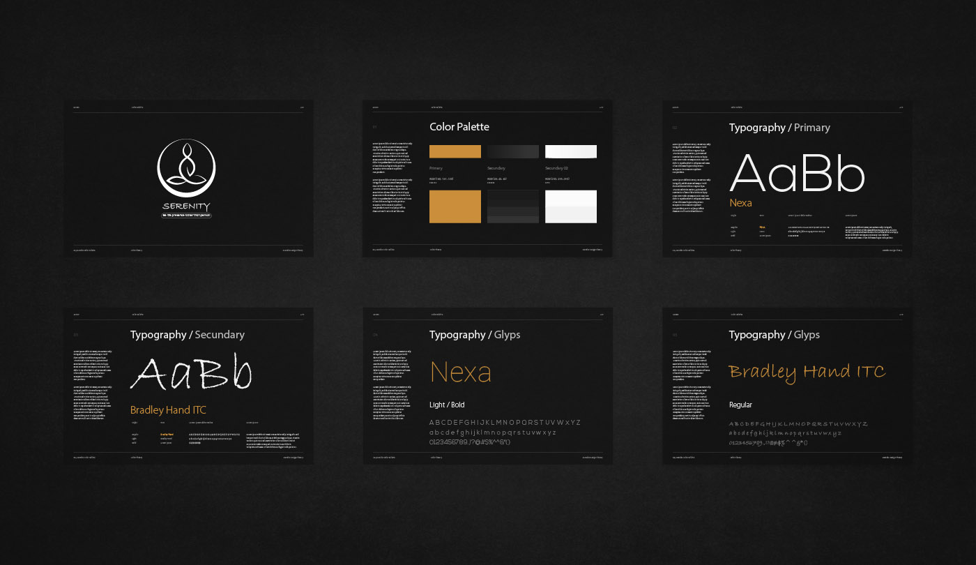
In keeping with the theme of simplicity, we opted for a monochromatic palette of black and white as the primary colors. To infuse warmth and vitality,
we introduced a subtle touch of orange—a hue that embodies balance, warmth, and enthusiasm, mirroring the core principles of yoga.
This nuanced color choice harmonizes seamlessly with the overall concept of the logo, capturing the essence of yoga practice with clarity and grace.
