PROJECT
LinkedIn ‒ Detailed UI/UX Redesign
MY RESPONSIBILITY
UX/UI
Graphic Design
Web Design
YEAR
2020
LinkedIn is one of the most used and popular websites with over 660+ million users and a revenue of $ 6.8 billion, used by every student, business, and IT professional.
Аlthough I use LinkedIn on a daily basis and I am really pleased and grateful for this platform however, as a UX-designer , I can see some flaws in the LinkedIn platform.
So, for a challenge, I decided to delve deeper into the design of their website by finding problems and proposing innovative solutions.
Case Study
Many of us, both students and employees are in a constant search for jobs. On an average, a person who is out in the market looking for a job applies to 30–40 jobs in a day. Linkedin provides a lot of features for job search and communication, but there are few things which it misses. Obviously, a single portal cannot do it all.
The task was now clear, I needed to create (somewhere inside of LinkedIn) an attractive appointments system where LinkedIn users looking for a job could feel “safe” & efficient.
I divided the task into 2 parts:
- Job Search and
- Communication
So, the process started like this. Since most of us face this common problem I make contact with a few regular LinkedIn users and was fascinated to see of comments and messages about the design flaws of LinkedIn apps. I tried to understand and listed out all the problems which the users were facing and noted down the things which needed to be retained.
LinkedIn users looking for a job need to build meaningful connections because they don't want to miss opportunities, be exposed to strangers & lose time.
Data Analysis
I tried to analyze the current scenario in the case of applying for jobs and the post-application process and was found many cases in the workflow where a lot of time is being wasted and there can be a room for improvement in the application and interview process.
Since I have come up with the current usability flaws with the system I started to think of ideas to make the flow better. I started sketching simultaneously at the same time to come up with some features which would delight the users a lot. Here is a list of features that's nice to have:
- Quick Search
- Applied jobs seaction
- Improved filters
- Save jobs
- Apply job button
- Show (applied) Jobs
- Interview stage
- Scedule interview
- Companies Search
- Salaries
- Recomended Jobs
- Calendar view - Upcoming interviews
Wireframes - Job Search
After several iterations of quick sketches, i proceeded further to create wireframes to get a sample look and understand the flow between screens. Here are the screens created.
To understand each feature better I have given notes on each page. This was also tested with the potential users and got an amazing feedback which says that the users love it and say that the features presented solves their daily problem of job applications & tracking.
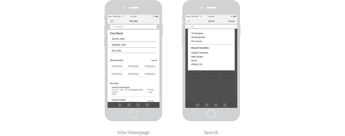
Jobs Homepage Wireframe:
- The section with (Saved Jobs, Applied Jobs and My Stats) showing useful information about the jobs. By clicking on them it would take you to the respective list.
- Recommended will give you easy acces to the roles you often search. This saves an additional - instead of going to search box and then typing the role.
- My Feed is a feature that suggests the opened jobs, that match your skills based on your previous data.
Search Wireframe:
- Intelegent suggestions showing the titles and jobs related to User Experience.
- Recent Searches showing the most recent searches by you.
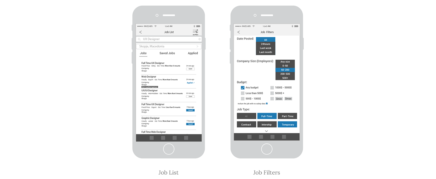
Job List Wireframe:
- Save Job is a feature that would be of great help for the applicants who want to apply for the job latter.
- Well-Qualified Applicant - The applicant will know if he/she is in the top 20% of the job applicants. This will prompt the applicant to apply for the job as he is most likely to match with the skills given in the job.
- Also Applied is one of the most useful and time-saving features, as most of the time you applied to a job, but when you come back and do a search the portal shows the same job but it doesn't indicate that is applied already - That's not a good UX.
Job Filters Wireframe:
- Date posted allows us to change options to ease readable and useful formats like day, week, or month.
- Company Size matter to some applicants who want to join startups or a company that is just growing.
- Budget it is clear to all of us, here we choose the amount for which we would work the project or the salary if we work a full-time job. (There is also included an option to “Include jobs with no salary data” so that the job cards without any salary are also listed when searched.)
- With Job type feature we can choose which job type we are interested in (if we want a full-time job or maybe part-time project), we can also select multiple options
Wireframes - Interview
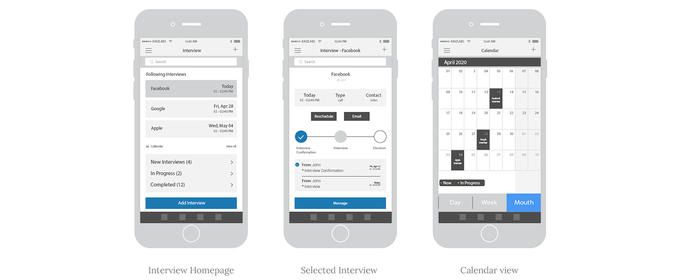
Interview Homepage:
- Interview List Cards - the most important feature that will change the entire game on interview tracking, showing the most important information for the interview like the name of the company, date, time, and duration. Users can easily check their upcoming interviews.
- Calendar The calendar option will give you a great overview, which helps the user better visualize and understand the scheduled events.
- Also, above the "Add Interview" button there is navigation to categorized interviews based on the stage in which the applicant is.
Selected Interview:
- More detailed info about the interview such as the contact, date, and type of the interview, and options to reschedule the interview and send an email.
- There are also icons that represent the stages of the interview process, by clicking on the icon it will take the user to the selected stage.
Calendar view:
- The interviews are presented in a clear and legible calendar format
- The user also can change the views easily using the options at the bottom of the screen( day, week, month).
Wireframes - Contact
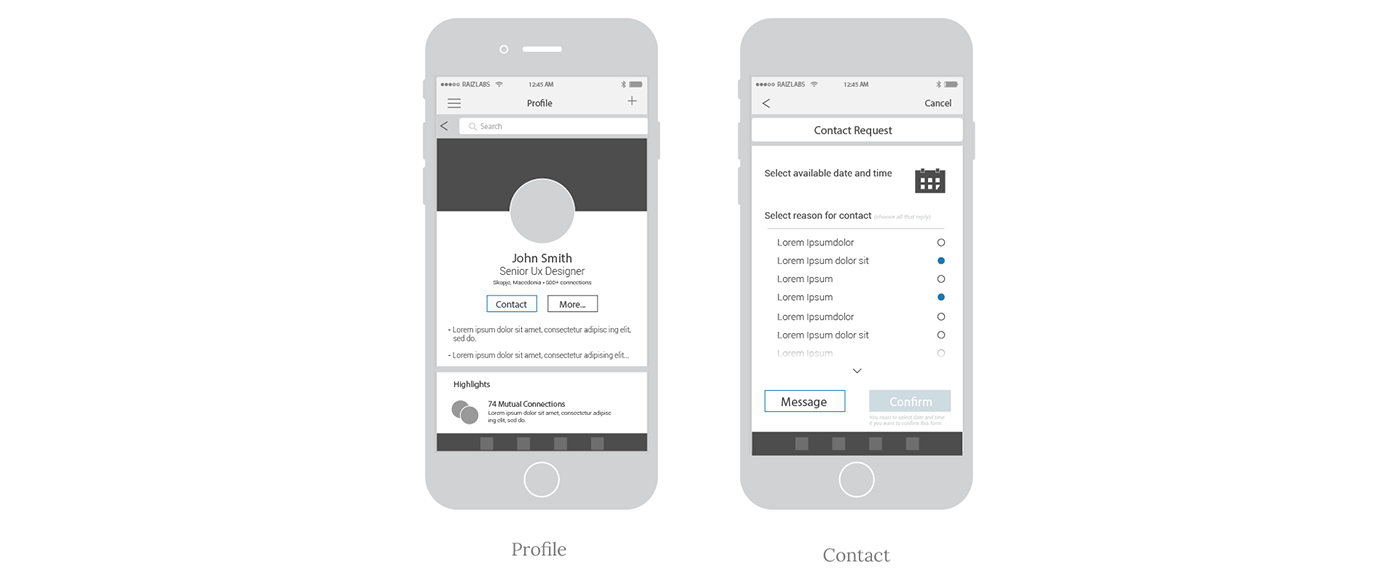
I understood that the appointments must be related to the relationships between recruiters and users, and should help create meaningful relationships between them.
Users do not like to get messages from contacts they don’t know, so I created an appointment system where LinkedIn users looking for a job and new opportunities could feel more safe & efficient.
Profile & Contact:
- We can see The Contact button included in the profile (at the place where it is currently located message option).
- While maintaining The Messaging option "hidden" inside the actual feature if the user however what to use the message option.
- In the Contact Request page, we can see a calendar (where we can make a schedule for making contact with the user)
- Another great feature in this page is Selected reason for contact feature where we can inform the user why we want to contact him (this is also a great tool to let the user know why we want to contact him and he immediately gets more trust and a better picture for us).
The idea is the Contact button to show on the profile is when the user is contacted for the first time, after the first contact if the user approves the contact form they will receive, the profile button will be again Message.
Wireframes - Promote New Contact Feature
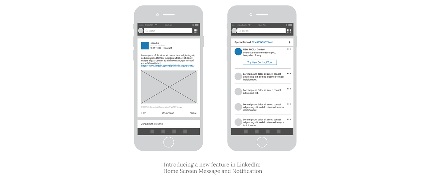
An additional challenge was to come up with an idea of how to promote within the application. A Promoted Post on the home screen, as well as Notification, will be selected interaction that can use LinkedIn to introduce a new feature:
However, adding a new feature will require full research on my part on how to introduce new complex features in existing apps. Obviously just including the alert in the home screen and a notification is not enough to motivate people to use Contact.
Homepage Post & Job feed redesign
Although the latest version of LinkedIn has been greatly improved with the latest redesign, there is still room for improvement.
Below is a comparison of the current LinkedIn design and the new version that I designed.
Wireframes - Current & New Version Layout
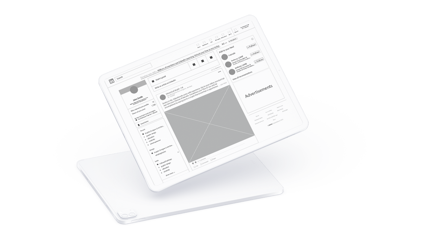
Current Layout
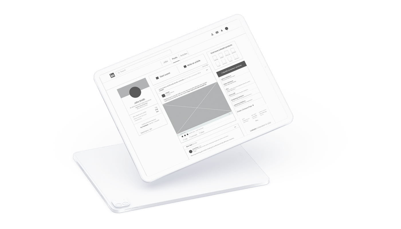
New Version Homepage Layout
Comparison: Current & New Version
Current Layout
- Navbar: there is too much-used space for icons and text below them (where they are explained) and there is not enough good visibility.
- On the top of the homepage layout, there are ads.
- Left-aside: We can see profile information which Is good, but also there is a section with Recent hashtags, groups, events and followed hashtags which is a section that is already in the "my network" icon in the navbar-menu, and there is no need to be there just to take up more space.
- Right-aside: There is an "add to your feed" section which is almost never used by the users and ads section which remain blank at this moment.
- Content: There are a few unnecessary click icons like "add a picture" and "post a video" which are already available in "Start a post" section.
New Layout
- Navbar: has used better whitespace and has better visibility. There is no text on the icons, but when you are in the hover state, a text with the meaning of the icon appears. Also several icons are left out so that the Jobs icon would be located below navbar together with Posts and Articles, and while the Work icon is missing and placed on the right side of the "layout" instead of Add to your feed - section, which in my opinion has no function and I removed it completely.
- On the top of the homepage layout, instead of the ads, there are three most important menus: Jobs, Posts and Articles.
- Left-aside: More visible and cleaner Profile information section, without other distractions such as (Recent hashtags, groups, events and followed hashtags), which we can notice in the current version. The same features can be found in the "my network" icon in the navbar-menu.
-
Right-aside: I made a section with "Visit more LinkedIn Products" and "LinkedIn Services",
in the current design they are placed in the top menu in the "work" icon.
I think it's much more important to see on the homepage what Business Services and Products that Linkedin offers than to have an "add to your feed section" that is almost never used by users. - Content: I design a post section with only "Start a New Post" and "Write an Article" sections, without other unnecessary features like "add a picture" and "post a video". The content design is good, so I made only minimal design changes in it.
Visual Prototype
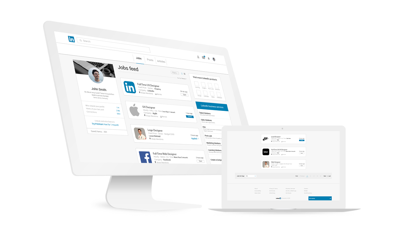
Jobs Feed
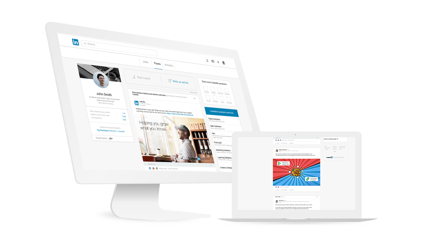
Posts
Bonus
Features that are good to mention
Several more useful features that will be good if LinkedIn introduce, this time I will mention them only (with a brief explanation), but the next time it would be good to elaborate in more detail.
LinkedIn Chrome Extension
This feature will enable you to get all important notification instantly by blinking the LinkedIn icon on your Google chrome, even if you don’t open your LinkedIn profile on your browser.
Put your connects into lists
When you put your connects into lists you can select a list to just see updates from those people, and when you're writing a post update you can use the drop-down box beneath to make sure only people on a certain list can see it.
See First - Feature
What this feature does is allow you to designate what people and pages you want to see at the top of the News Feed any time you log in - on mobile or desktop. Now I can put important people at the top of my feed and never miss a post!
Unsend Messages
A feature to allow users to "unsend" or revoke sent messages on LinkedIn, as WhatsApp and Instagram does, has been one of the highly demanded features.
Layout Dark Mode
A large group of users (including me) are already accustomed to working online with "dark mode layouts", so it would be great if LinkedIn also have this feature to turn on Dark Mode.
Conclusion
This project was fun, redesigning the LinkedIn platform was a challenging and enjoyable experience. It was clear from my research, case studies, and surveys, that LinkedIn users desired a more job-applicant friendly layout.
It has been an incredible learning experience. And since this whole project is about LinkedIn, here is my profile is you want to "connect" with me.